

Single-column, 80% width
This is an example of a single-column layout created using the “Single-column with 80% width” container. This container should always be used for single-column layouts, as otherwise the text would be too wide on desktop screens and therefore difficult to read.
Lorem ipsum dolor sit amet, consectetuer adipiscing elit. Aenean commodo ligula eget dolor. Aenean massa. Cum sociis natoque penatibus et magnis dis parturient montes, nascetur ridiculus mus. Donec quam felis, ultricies nec, pellentesque eu, pretium quis, sem. Nulla consequat massa quis enim. Donec pede justo, fringilla vel, aliquet nec, vulputate eget, arcu. In enim justo, rhoncus ut, imperdiet a, venenatis vitae, justo. Nullam dictum felis eu pede mollis pretium. Integer tincidunt. Cras dapibus. The element is always light grey. The vulputate is a light grey box. The vulputate has a light grey border, a light grey background, a light grey top margin, and a light grey bottom margin. The element is light grey at the front, with a light grey border, a light grey background, a light grey top margin, and a light grey bottom margin. The element is light grey at the front, with a light grey border, a light grey background, a light grey top margin, and a light grey bottom margin. The element is light grey at the front, with a light grey border, a light grey background, a light grey top margin, and a light grey bottom margin.
Zweispalter
Two-column layouts are particularly suitable for longer texts, including at the top of a page.
Lorem ipsum dolor sit amet, consectetuer adipiscing elit. Aenean commodo ligula eget dolor. Aenean massa. Cum sociis natoque penatibus et magnis dis parturient montes, nascetur ridiculus mus. Donec quam felis, ultricies nec, pellentesque eu, pretium quis, sem. Nulla consequat massa quis enim. Donec pede justo, fringilla vel, aliquet nec, vulputate eget, arcu. In enim justo, rhoncus ut, imperdiet a, venenatis vitae, justo. Nullam dictum felis eu pede mollis pretium. Integer tincidunt. Cras dapibus. The element is always light grey. The vulputate is a light grey box. The vulputate has a light grey border, a light grey background, and a light grey border.
Aenean is black. When mountains are born of companions, ancestral spirits and the great gods, a ridiculous mouse is born. The felis is black, the ultricies is black, the pellentesque is black, the pretium is black, and the sem is black. The consequat is black, the quis is black, and the enim is black. The pede is black, the fringilla is black, the aliquet is black, the vulputate is black, and the arcu is black. In enim justo, rhoncus ut, imperdiet a, venenatis vitae, justo. Nullam dictum felis eu pede mollis pretium. Integer tincidunt. Cras dapibus. Vivamus elementum semper nisi. Aenean vulputate eleifend tellus. Aenean leo ligula, porttitor eu, consequat vitae, eleifend ac, enim. Aliquam lorem ante, dapibus in, viverra quis, feugiat a, tellus. Phasellus viverra nulla ut metus varius laoreet. Quisque rutrum. Aenean imperdiet. Etiam ultricies nisi vel augue. Curabitur ullamcorper ultricies nisi. Nam eget dui. Etiam rhoncus.
Example: Highlight box
The Highlight Box allows you to visually highlight individual sections with a light blue background. This is particularly useful, for example, for short, important passages of text.
For the text in this example, a single-column layout with 80% width has been selected. Other content elements can also be inserted into the Highlight Box, e.g. two-column layouts. Headings can be hidden for all content elements. However, they are generally helpful for structuring the page.

Text media element
There is space here for your text. You can position the image to the right or left of the text. Make sure that the text does not extend beyond the height of the image in the desktop view. For longer texts, it is better to insert a new single- or two-column section below the text-media element.
If you wish to add a caption, click on “File list” in the left-hand menu bar. Add your caption here and then return to your page. The caption will then appear automatically below your image. Please do not insert captions in the text block next to the image.
Text media element, image can be enlarged
With this text-media element, the image can be enlarged by clicking on it.
There is space here for your text. You can position the image to the right or left of the text. Make sure that the length of the text does not exceed the height of the image in the desktop view. For longer texts, it is better to insert a new single or double column below the text media element.
If you wish to add a caption, click on “File list” in the left-hand menu bar. Add your caption to the image here and then return to your page. The caption will then appear automatically below your image. Please do not insert captions in the text block next to the image.

Accordion
When creating new accordion elements, please ensure that the heading of the text element is hidden. The container group already has a heading (in the example: “Accordion element – text only”). If the text element also had a heading, there would be two, which is generally unnecessary from a semantic point of view and may even be misleading, as they would appear one after the other.

When creating new accordion elements, please ensure that the heading of the text media element is hidden. The container group already has a heading (in the example: “Accordion element text and image”). If the text media element also had one, there would be two, which are generally not necessary from a semantic point of view and may even be misleading, as they appear directly one after the other.
Gallery
-
 Jana Zöller
 -
 Jana Zöller
 -
 Jana Zöller
 -
 Jana Zöller
 -
 Jana Zöller
 -
 Jana Zöller
 -
 Jana Zöller
 -
 Jana Zöller
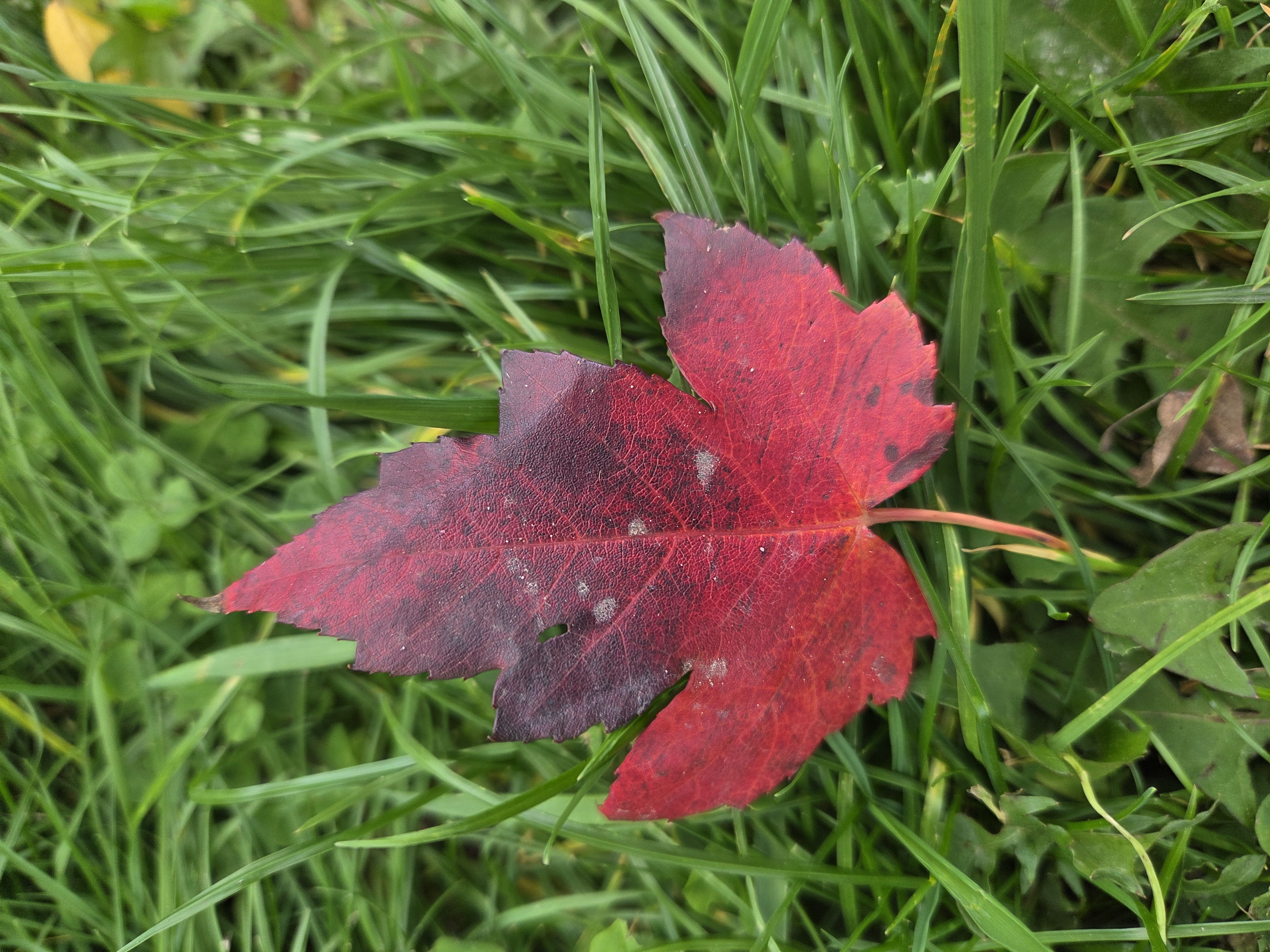
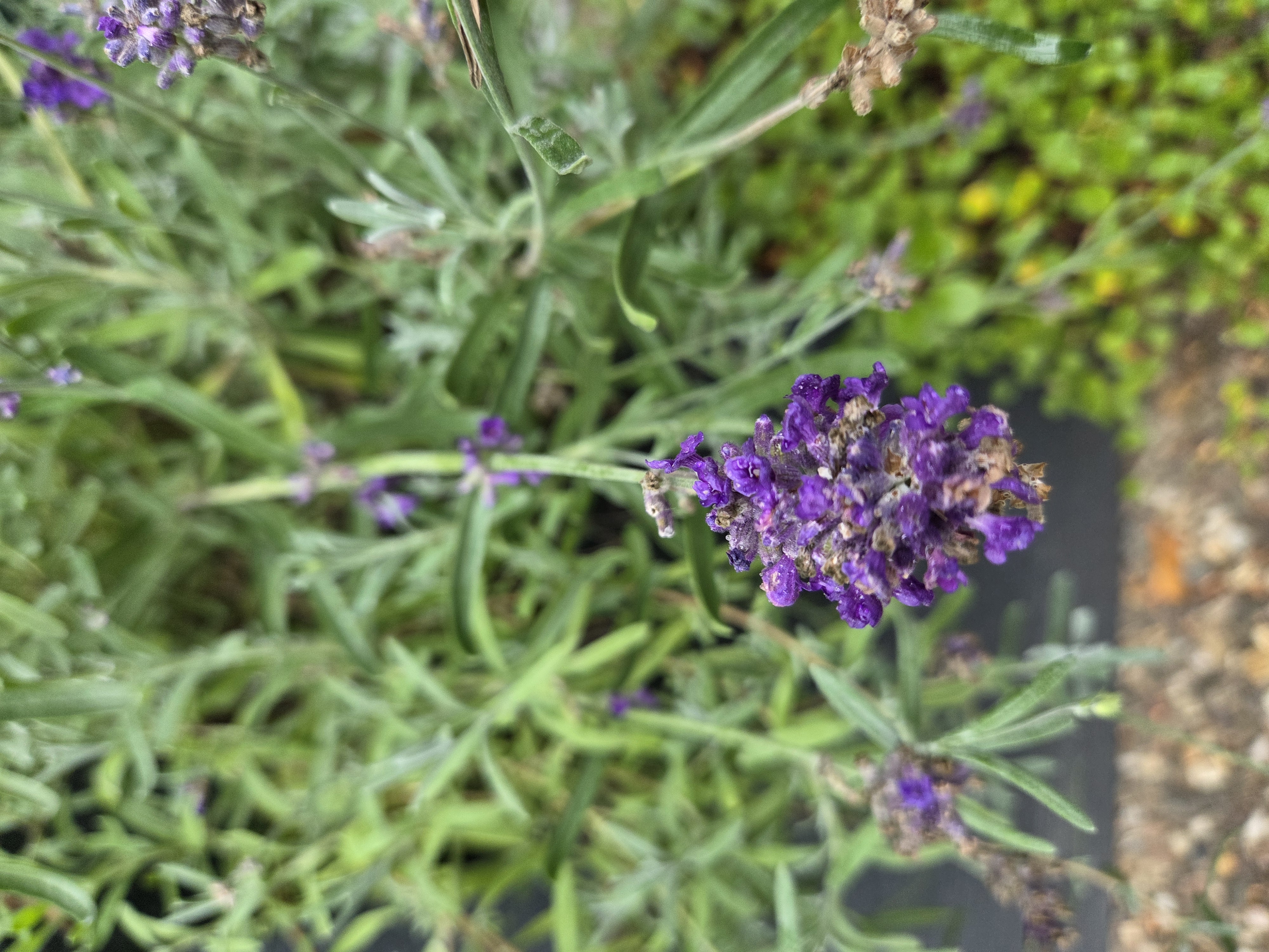
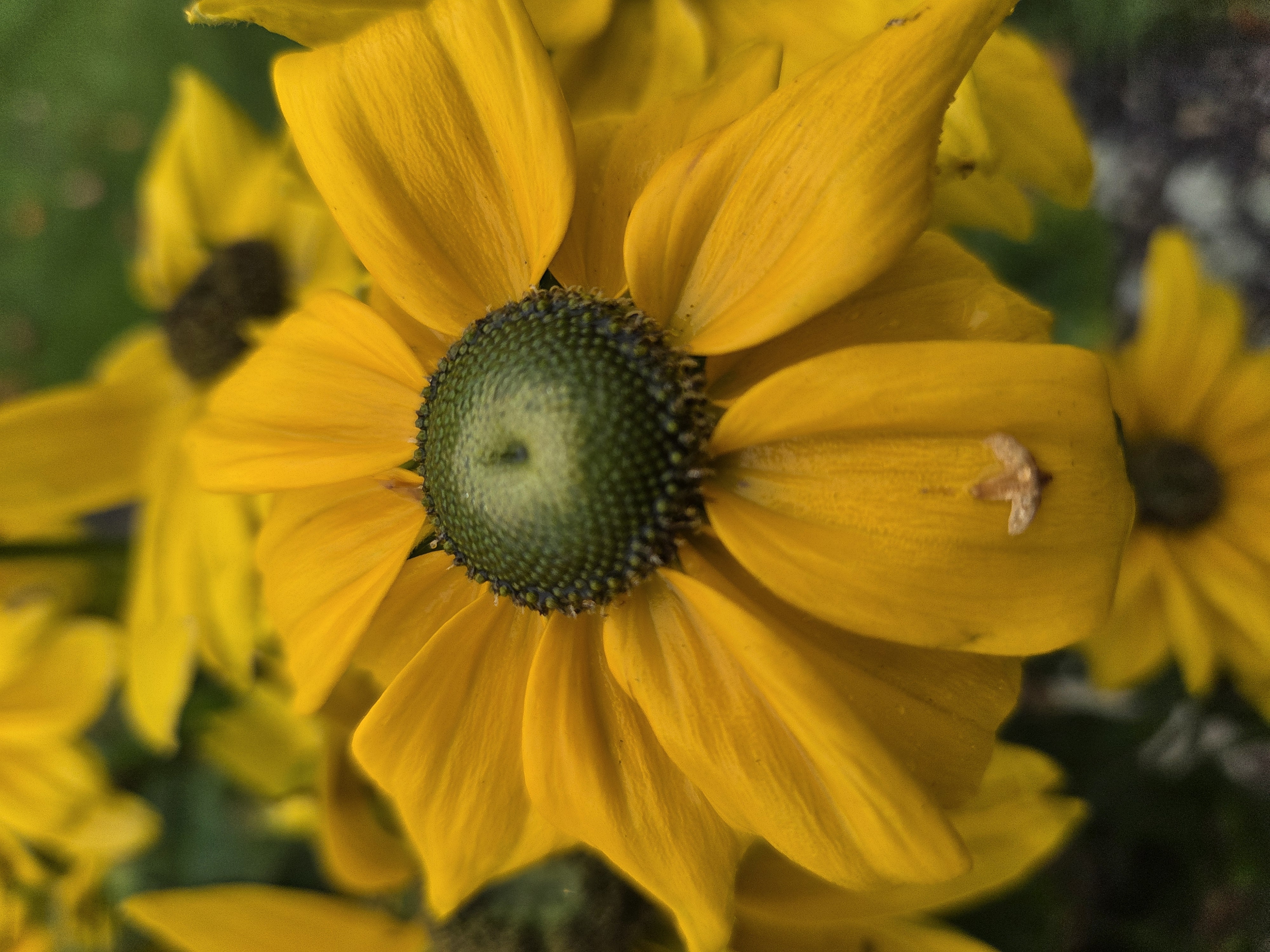
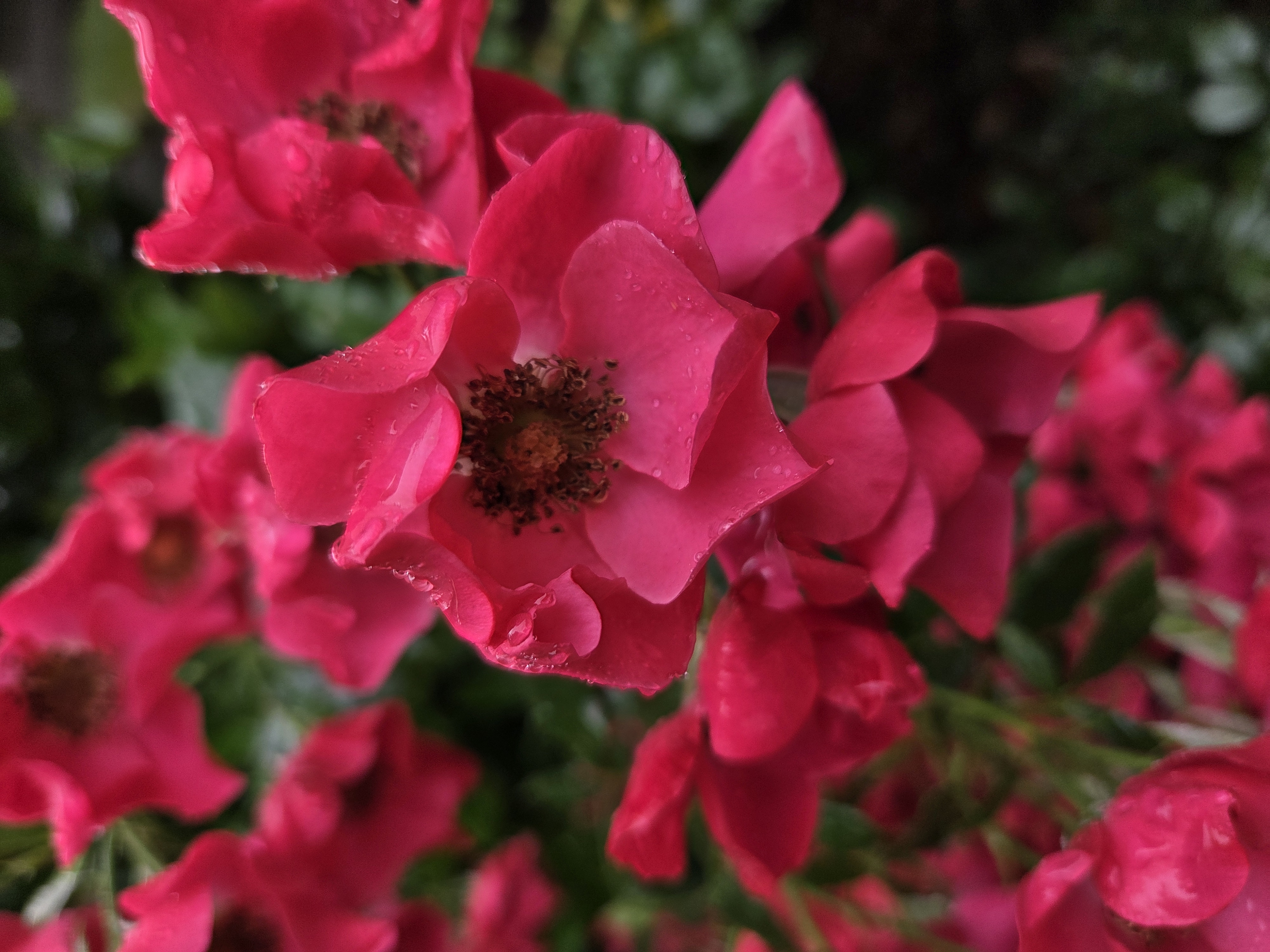
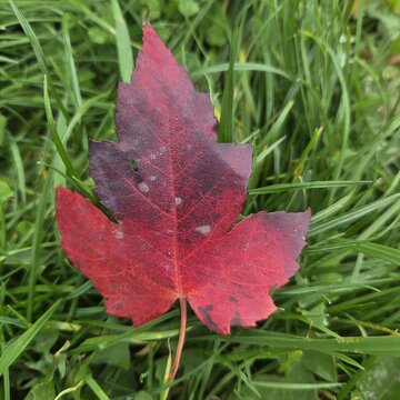
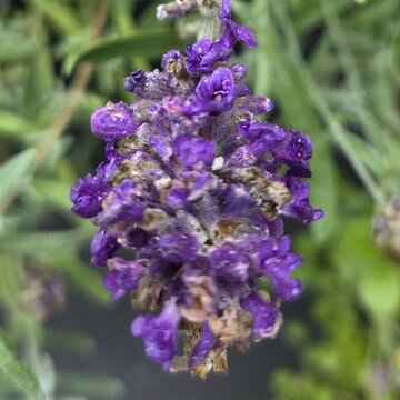
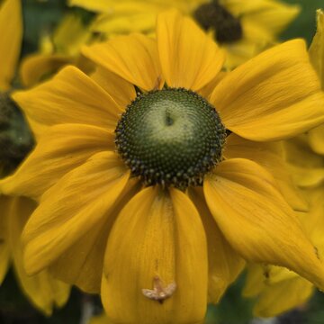
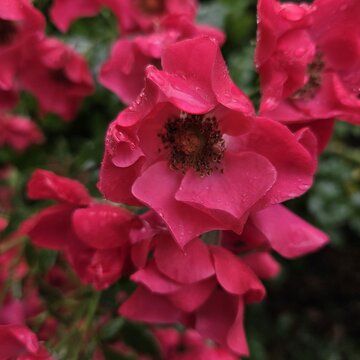
Notes on the gallery: You can add as many images as you like to the gallery. In the gallery settings, under the ‘General’ tab → ‘Gallery Layout’, you can choose whether to display all images on the page, or just 4, 8 or 12 as a preview. If the preview option is selected, a ‘Show more’ button appears below the images, which displays the remaining images only once the gallery is opened.
Video
There is space here for a brief description of the video. Please ensure that your video has subtitles.
Table
| Example Column 1 | Example Column 2 | Example Column 3 |
|---|---|---|
| Example Row 2 | Example Row 2 | Example Row 2 |
| Example Row 3 | Example Row 3 | Example Row 3 |
| Example Row 4 | Example Row 4 | Example Row 4 |
| Example Row 5 | Example Row 5 | Example Row 5 |

Separator
You can add or remove the “separator” lines above and below this block of text – whichever suits your content or the design of your page best. They are particularly useful if you
- want to create a clear visual separation between sections, or
- the elements above and below this block contain few visual elements. In such cases, these separators can be used as a stylistic element.
Please use separators sparingly and only select them where they make sense for the reasons mentioned.
Separators are standalone content elements and can be added in the page’s “Builder”. To do this, under “Create new content”, select the “Special elements” tab and then “Separator”.

Coloured section
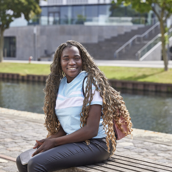
If your page lacks visual appeal, we recommend adding a coloured background to certain sections of the page. To do this, you can either select the “Highlight Box” (see above), which applies a light blue background across the width of the content area. In contrast, the “Section” offers the option of applying a light blue or light grey background across the entire width of the screen. You can use the section by copying it, or by creating a “Section” container for a new element and placing any content element (e.g. a two-column layout) within it. When editing the section, you can change the “Background colour” under “Appearance”.
Downloads
- Example video: Big Buck Bunny (mp4 - 30 MB) Description: Sample video
- Sample audio (mp3 - 494 KB) Audio file description
- Sample image (png - 663 KB) Description Sample image
- Sample PDF (pdf - 36 KB) File description



Explanation of contact teasers: The contact teasers are generated automatically in TYPO3. The details of all staff members are stored in the master data file in TYPO3. When you select the desired contact person, the details are automatically inserted into the preview tile and on the contact details page. Individual details in the preview tile cannot be edited manually.
To create a person teaser, click on the folder on the far right under the Plug-in tab. In the dialogue box that opens, click on the ‘Records’ folder on the left, then on the ‘People’ subfolder. Here you can add the desired person.
You have the option of displaying either the teaser for one or more people in landscape format or three teasers side by side. To change the view, click on ‘1 column’ or ‘3 columns’ under ‘Template layout’ at the very bottom of the ‘Plug-in’ tab.
Explanation: Related Pages Teaser
Related Pages Teasers can be used to provide a preview of other pages on HSRW website. To use this element, go to Edit the content element (pencil) → General tab → Starting point and click on the folder on the right. Here you can select the pages that are to be displayed in this location.
To ensure that text and images appear automatically, it is necessary to set a teaser text and a teaser image for all pages to be displayed here. This can be done on the respective pages: Page properties → General tab → at the very bottom, Teaser text and Teaser image.
The following content elements are available:
- Related Pages Teaser: three columns side by side on the desktop; from the fourth linked page onwards, a new row appears with up to three columns side by side
- Related Pages Teaser Slider: the slider appears from the fourth linked page onwards
- Related Subpages Teaser: Automatically displays a preview of all subpages of the selected page (three columns side by side; from the fourth page onwards, a new row appears with up to three columns side by side)
Jump links
Here’s how you can use ‘bookmarks’ to add direct links to sections on your page in the header area:
- Before each element to which a jump mark should lead, click “Create new content”
- Select “Special elements”
- Select “Hidden Anchor”
- Give the jump label a name
- The set jump mark(s) will automatically appear at the top of the header section. They are only visible there; they do not appear elsewhere on the page.
Headings
Headings for content elements can be hidden if required. To do this, go to the “General” tab for your element, select “Hidden” from the “Type” drop-down menu under “Heading”.
The H1 heading cannot be added manually. It is maintained in the page properties and set automatically. The following (sub)headings can be set for the rest of the page:
I am an H2 heading
Lorem ipsum dolor sit amet, consetetur sadipscing elitr, sed diam nonumy eirmod tempor invidunt ut labore et dolore magna aliquyam erat, sed diam voluptua. At vero eos et accusam et justo duo dolores et ea rebum.
I am an H3 heading
Lorem ipsum dolor sit amet, consetetur sadipscing elitr, sed diam nonumy eirmod tempor invidunt ut labore et dolore magna aliquyam erat, sed diam voluptua. At vero eos et accusam et justo duo dolores et ea rebum.
I am an H4 heading
Lorem ipsum dolor sit amet, consetetur sadipscing elitr, sed diam nonumy eirmod tempor invidunt ut labore et dolore magna aliquyam erat, sed diam voluptua. At vero eos et accusam et justo duo dolores et ea rebum.
I am an H5 heading
Lorem ipsum dolor sit amet, consetetur sadipscing elitr, sed diam nonumy eirmod tempor invidunt ut labore et dolore magna aliquyam erat, sed diam voluptua. At vero eos et accusam et justo duo dolores et ea rebum.
I am an H6 heading
Lorem ipsum dolor sit amet, consetetur sadipscing elitr, sed diam nonumy eirmod tempor invidunt ut labore et dolore magna aliquyam erat, sed diam voluptua. At vero eos et accusam et justo duo dolores et ea rebum.