Design students of the Faculty of Communication and Environment develop new logotype for the city of Wesel. The three best designs have now been awarded.
As part of a competition in winter semester 2017/2018, 36 students of the bachelor’s degree programme “Information and Communication Design” developed their innovative ideas, supervised by Professor Zielke.

Professor Zielke points out that the current logo does not only lack clarity and expressiveness, but is also unsuitable for smartphones. “Good corporate design is powerful, consistent and creative. It has to illustrate a town’s identity and must be flexible enough to be adapted to different contexts. This is the only way to guarantee that the new visual identity will stand the test of time.” he says.
The project was carried out in close cooperation with the city's officials. The process included a “public input” event and meetings with various advocacy groups. In addition, an important basis for the conceptual work was a study conducted in 2016, in which 850 people were questioned about their views of the city.
The students developed 35 concepts out of which the best three have now been awarded. The winners were: Antonios Jansen-Gessas (1st prize worth 7000€), Lena Lengner and Mara Heemskerk (2nd prize, worth 3000€) and Quyen Ta Ngoc Mai (3rd prize, worth 1000€). The jury consisted of the Mayor Ms. Westkamp, representatives of council and administration as well as the experts Jürgen Adolph (KW43) and Prof Kai Bergmann (University of Augsburg).
The Winners
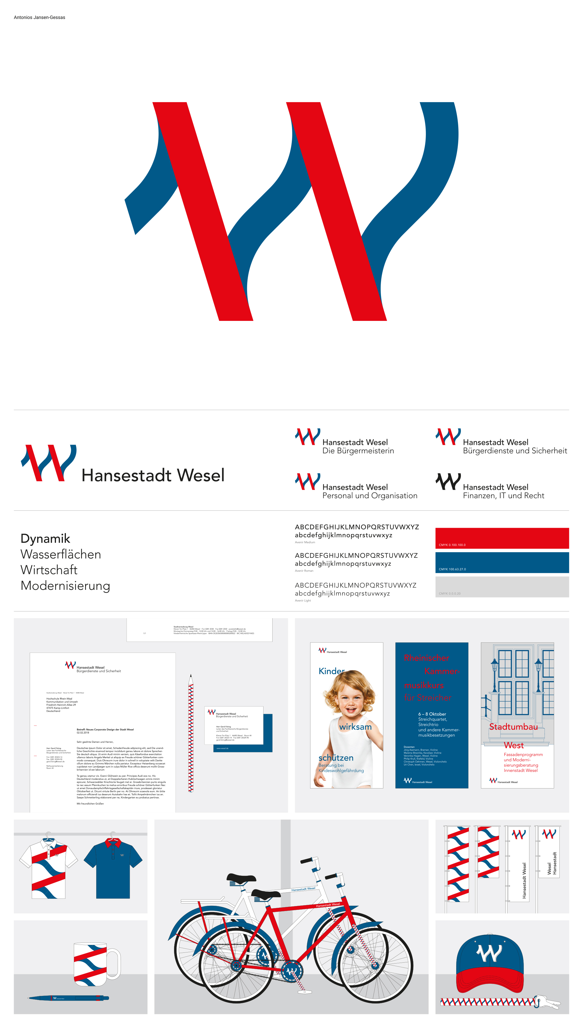
Antonios Jansen-Gessas’ W-shaped logo refers to the Rhine and the importance of the city’s various water areas. The jury praised the strength, uniqueness and retentiveness of the design. They were impressed by the way Jansen-Gessas managed to create what is particularly difficult: a design which is simple, but unique. The concept has got a high recognition factor and was described as highly functional as well as lively, likeable and contemporary. This way it has got the potential for flexible expansion in the future.
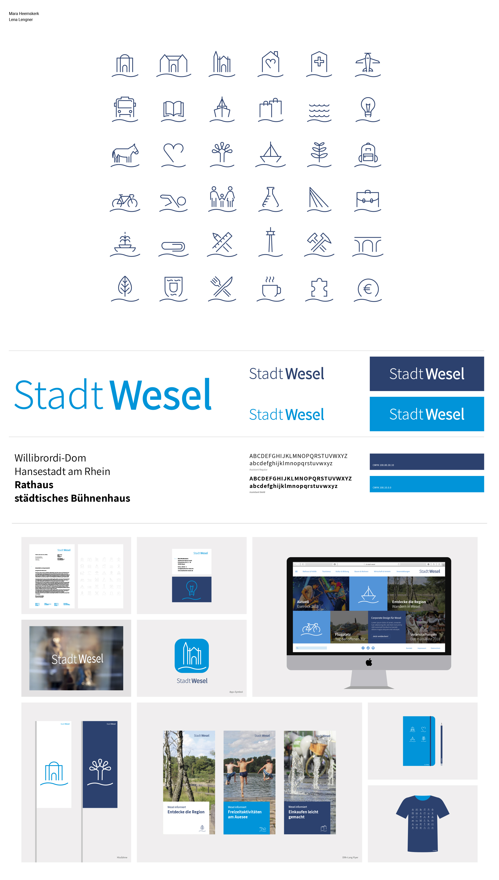
Mara Heemskerk and Lena Lengner’s concept is based on a lovingly elaborated pictogram system, which allows all city themes and sights of the city to be captured. The clear and fresh design concept offers an impressive solution for every application.
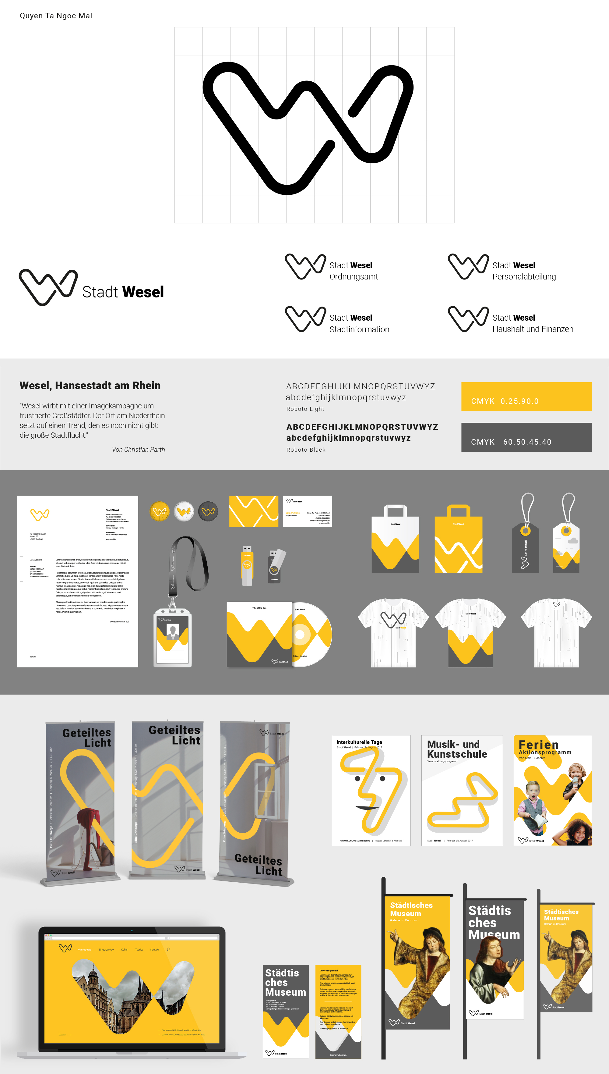
The design by Quyen Ta Ngoc Mai convinced the jury thanks to its creative media design. The dynamic symbol allows for various usages: sometimes it is part of an illustration, sometimes a full-size pattern, sometimes a frame for images. This way, the concept combines diverse contents in a charming and lively way.
In future, the winning concept will be elaborated including data sets of design elements and a corporate design manual. The city council will then decide at the beginning of March, whether they are going to accept it as the town’s new corporate design. If they do, it is going to be implemented gradually.
All 35 concepts will be exhibited on the Kamp-Lintfort campus soon. Please find details on the faculty’s website.