Two design students made it into the top ten
The Information and Communication Design programme once again took part in this year's Frankfurt Book Fair poster competition with students from the second semester. A jury of five judged the 250 designs submitted. With Philip Martin Pothfelder in second place and Henri Morschek, two students made it into the top ten.
With its annual poster competition the Frankfurt Book Fair intends to welcome the Guest of Honour and invite the reading public to discover the host country at the Book Fair. At the same time, it promotes the next generation of designers by challenging them to create an original poster related to the host country.
Participants are completely free in the development of ideas. The only restriction is that the logos of the Book Fair, the Cultural Office in Frankfurt, the competition logo and the logo of the host country - this year it is Norway - must be integrated. A maximum of 20 poster designs can be submitted per participating university.
A total of 16 universities took part in the competition. A five-member jury consisting of representatives of the Frankfurt Book Fair, the organising committee of the Guest of Honour 2019, the Museum Angewandte Kunst Frankfurt, the Cultural Office of the City of Frankfurt and the design agency Michael Eibes Design has now selected the ten best designs. The three winners will receive cash prizes. All ten motifs are available as postcards at the Frankfurt Book Fair and can be seen at the Frankfurt Book Fair in October. The Museum Angewandte Kunst will exhibit them in the foyer.
The two second semester students Philip Martin Pothfelder and Henri Morschek made it into the top ten. Philip Martin Pothfelder won second place endowed with 1,000 Euros. His poster was inspired by the German tongue twister "Fischers Fritz". Its Norwegian translation "Fiskeren Fritz" is printed on a light blue background. His design is underpinned by a fish and playfully combines the familiar with the unknown. "The dadaistic-looking translation of a German tongue breaker into Norwegian and the consistent design convinced the jury. The visual and linguistic levels are brought together so harmoniously that one is tempted to hum the bumpy tongue twister while deciphering", said the jury. Morschek's poster shows a fjord made up of individual black lines. The red line "Read between the lines" creates a subtle connection to literature.
Since its first participation in the poster competition in 2015, Rhine-Waal University students have always been successful. A special triumph since they have to compete with much more advanced students from other universities.
Information
Fotos
© Philip Martin Pothfelder |
Henri Morschek
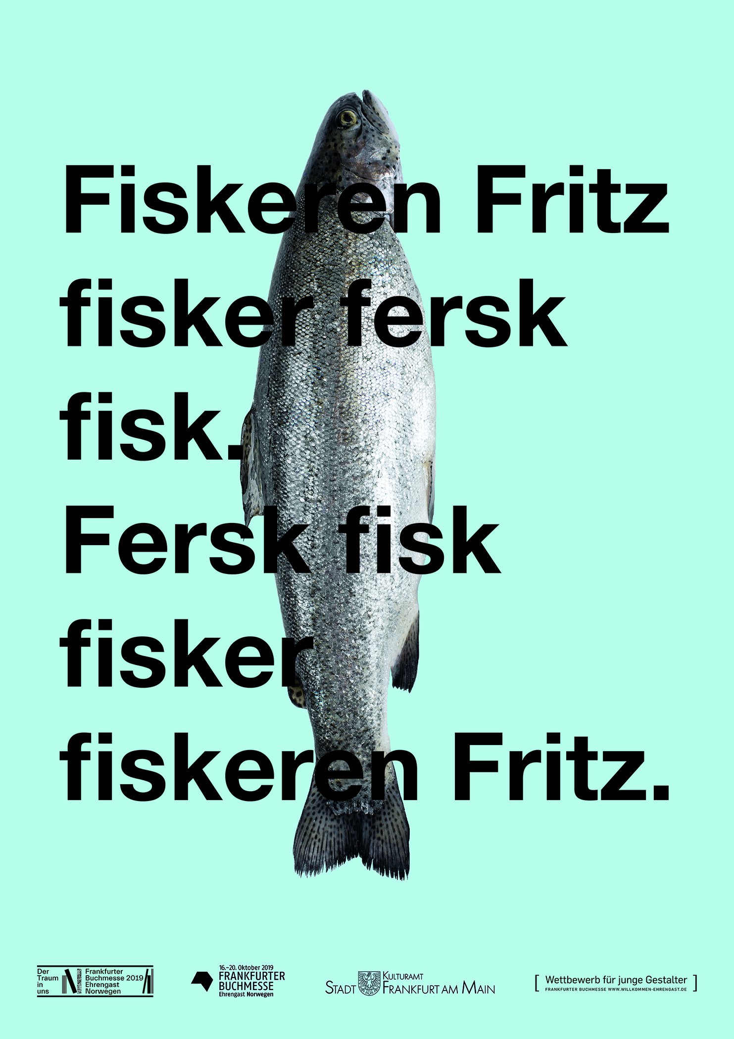
Design by Philip Martin Pothfelder
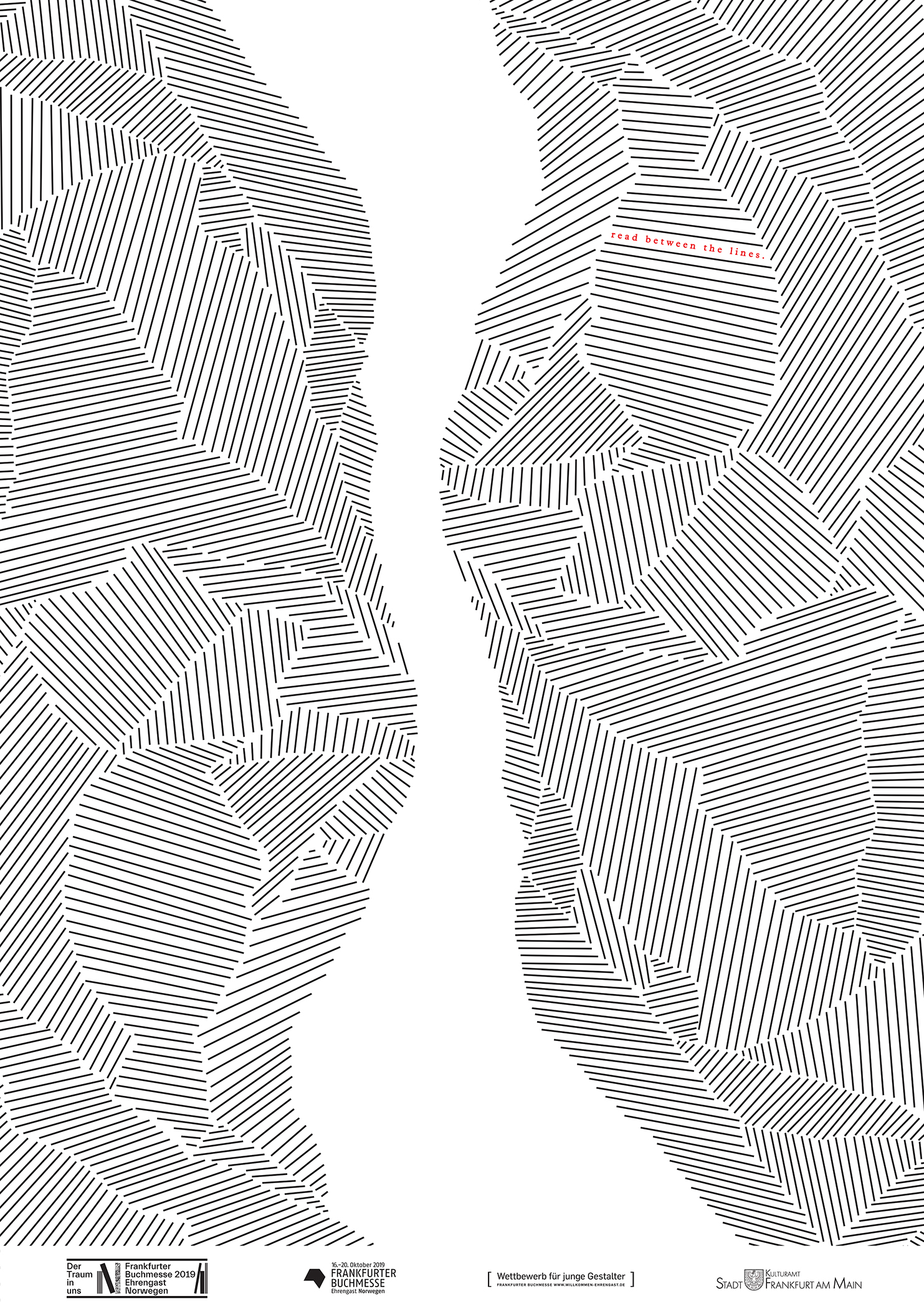
Design by Henri Morschek